A one-page sales dashboard in Excel needs only three things: PivotTables to summarise the data, PivotCharts to show it, and a slicer connected to every chart, so one click on a month updates the whole page.
Video
The data
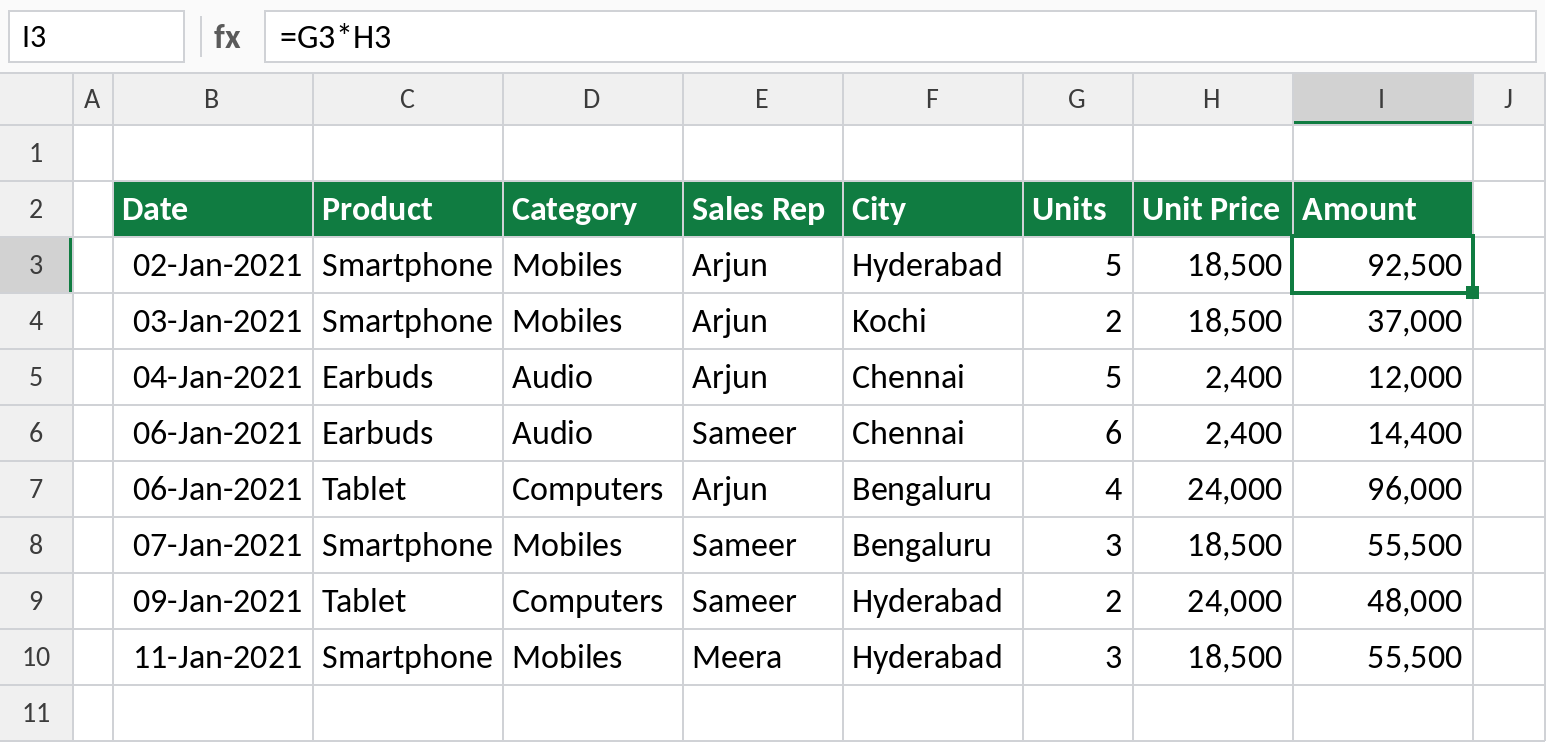
Sales of a company selling electronic gadgets in Indian cities through 2021: 1,560 rows with Date, Product, Category, Sales Rep, City, Units Sold, Unit Price and Amount.
Step 1: Five PivotTables
- Click in the data and choose Insert → PivotTable → New Worksheet.
- Drag City to Rows and Amount to Values. Format the values with a thousands separator and no decimals.
- Name the PivotTable City (PivotTable Analyze → PivotTable Name).
- Copy the PivotTable, swap City for Product and name it Product.
- Repeat for Sales Rep and Category.
- For the last copy, use Date and group it by Months. Name it Months.
Naming each PivotTable makes them easy to find when you connect the slicer.
Step 2: Five charts on a Dashboard sheet
Add a new sheet called Dashboard. For each PivotTable, click inside it, insert the chart, tidy it, then cut and paste it onto the Dashboard sheet.
| PivotTable | Chart | Title |
|---|---|---|
| City | 2-D Line | Sales by City |
| Product | Clustered Column | Sales by Product |
| Sales Rep | Clustered Bar | Sales by Rep |
| Category | Pie, with category names as labels | Sales by Category |
| Months | Clustered Bar | Sales by Month |
To keep each chart clean: right-click the field buttons → Hide All Field Buttons; remove the gridlines, legend and value axis; and add Data Labels. On the monthly bar chart, right-click the month axis → Format Axis → tick Categories in reverse order so January is at the top.
Step 3: A slicer for all charts
- Click any chart and choose PivotChart Analyze → Insert Slicer → Months.
- In the slicer’s settings, set Columns to 3 so the months sit in a neat block.
- Right-click the slicer → Report Connections and tick every PivotTable: City, Product, Sales Rep and Category.
Now click a month, or hold Ctrl and click several, and every chart updates together. Untick View → Gridlines on the Dashboard sheet for a clean finish.
Things to know
- If you add new sales rows, right-click a PivotTable → Refresh. Turning the data into an Excel Table first means new rows are always included.
- Report Connections only lists PivotTables built from the same data.
- Keep the number of charts small. Four to six on one screen is easy to read.