Gantt Chart is a horizontal bar chart used for project management and can visually represent a ‘Project Plan’ over ‘Time’. Gantt Charts can be used for scheduling Construction projects, Software development, Research & Design, etc.,
In this blog post, I will show you how to create a Gantt Chart using Microsoft Excel.
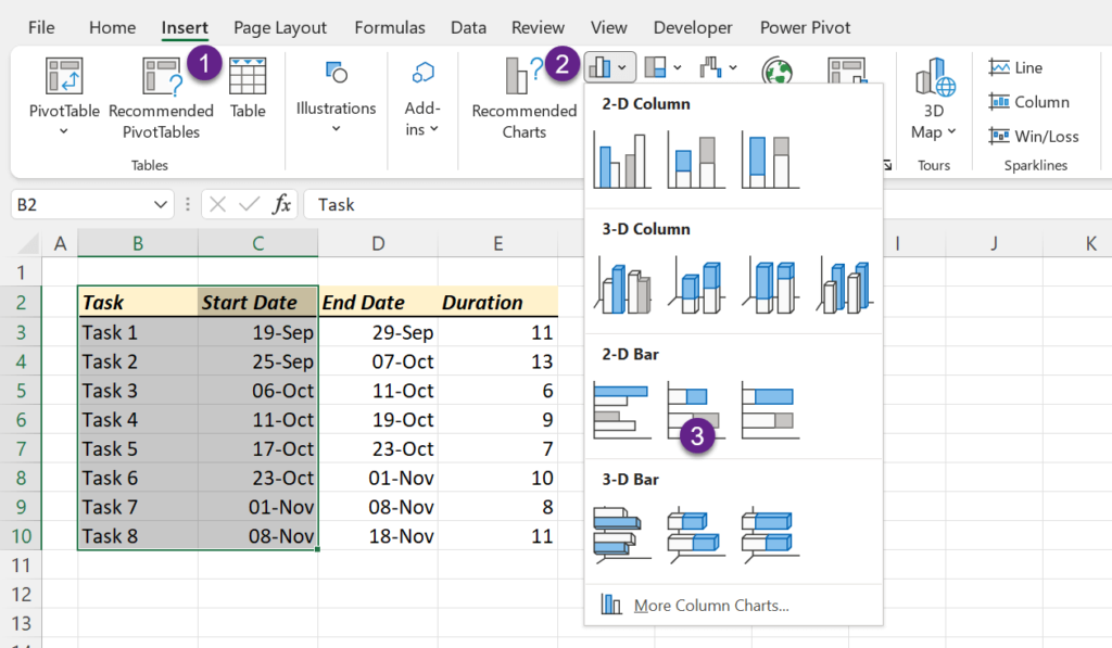
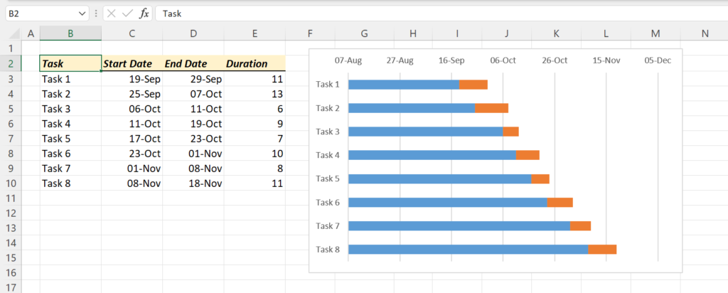
Following is the Task list of a particular project.
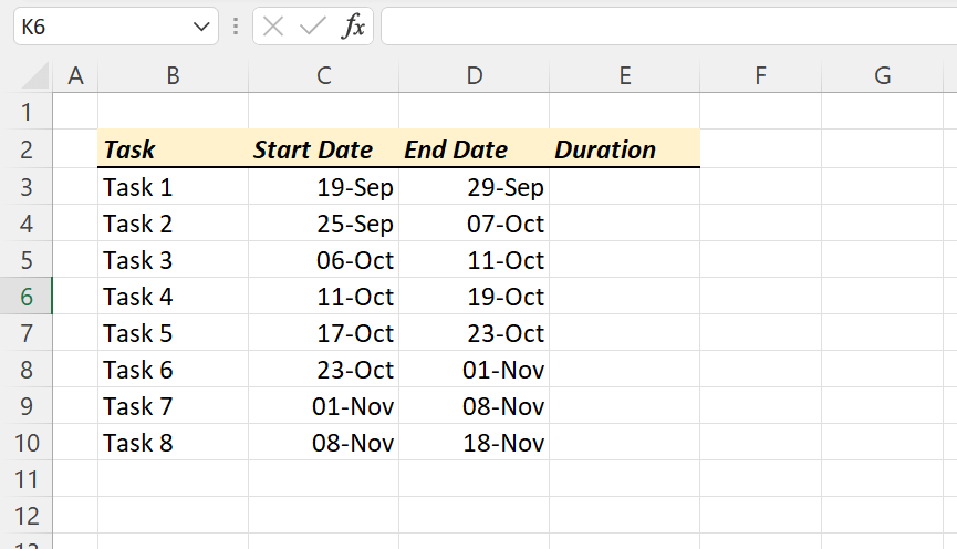
Task 1 starts on 19 – September – 2022 ends on 29 – September – 2022
. . . . . . . . . . . . .
. . . . . . . . . . . . .
Task 8 starts on 08 – November – 2022 ends on 18 – November – 2022.
Let’s see how to display these 8 tasks on a Gantt Chart.
Table of Contents
Calculate the duration of each Task
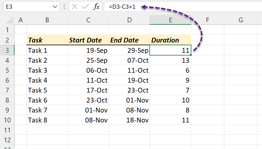
First of all we need to calculate the duration of each task. For that we should subtract Task Start Date from End Date and add 1 to it.
=Task End Date - Task End Date + 1
Create a Bar Chart using Task Start Dates
Once we have the duration of each task, next step is to create a Bar chart using the Task Names and Start Dates. For that,
select the columns containing ‘Task Names’ and ‘Start Dates’ > go to the Insert tab of the Excel ribbon > Insert Column or Bar Chart > Stacked Bar
A Stacked Bar chart is created, which represents the selected data.
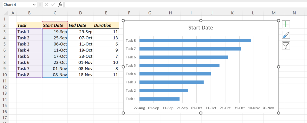
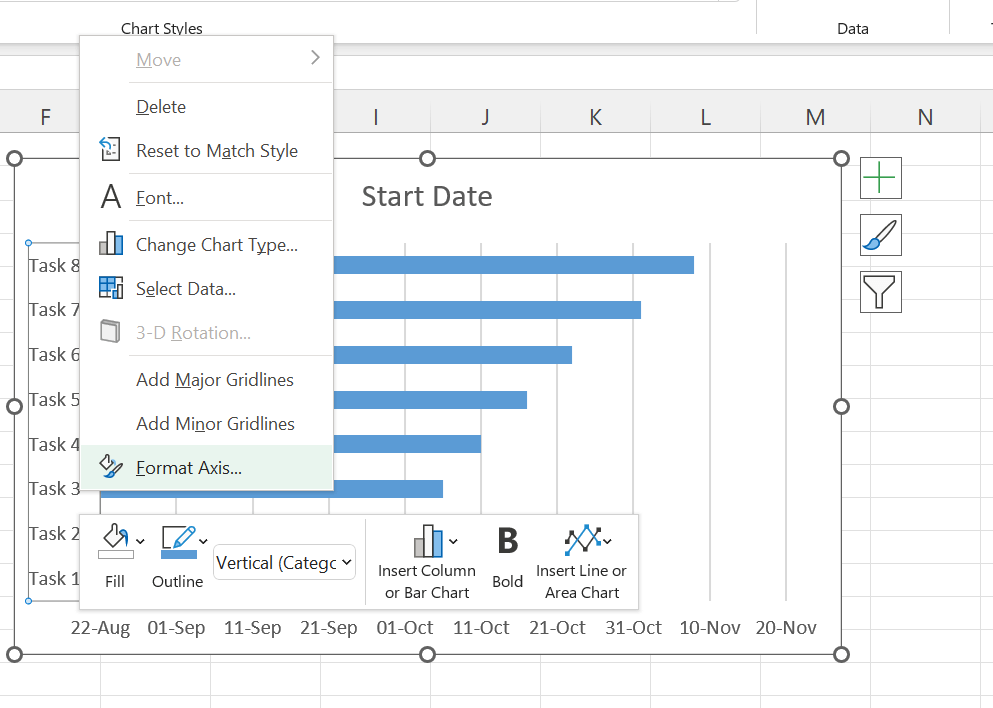
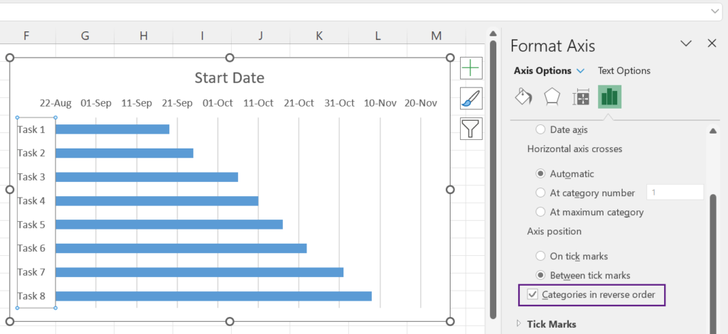
Right now, the Tasks are shown in the reverse order. To flip this and to align Vertical Axis labels in the correct order,
right-click on the Vertical Axis Labels > Format Axis…
In the task pane for Format Axis, mark the check box against the label, Categories in reverse order.
Add durations to Bar Chart
Next step is to display the duration of each task in the chart. For that,
right-click on the Chart > Select Data…
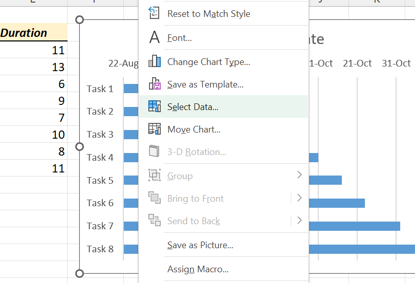
The dialog called Select Data Source will be activated, using which we can Add/Edit/Remove multiple Data Series to the Chart.
To add a new data series, Click on Add
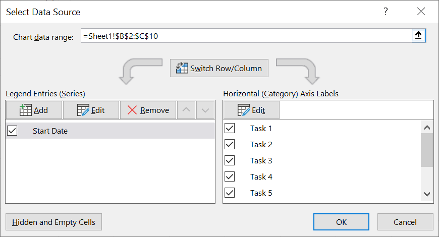
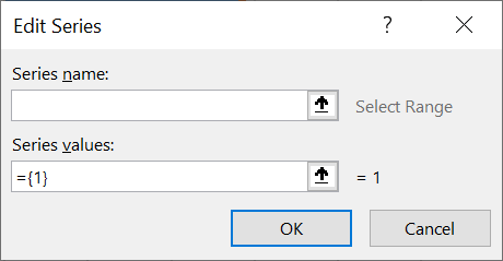
Another dialog called Edit Series is activated.
In this dialog we can specify the Series name and the location of the Series Values or the Values itself.
In this case, I have selected the cell E2 for ‘Series name’.
As the cell E2 has the text ‘Duration’ and this will become the Name of the new data series.
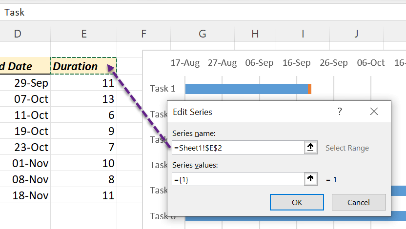
The cells from E3 to E10 contain the duration of tasks. These cells are selected for ‘Series values’.
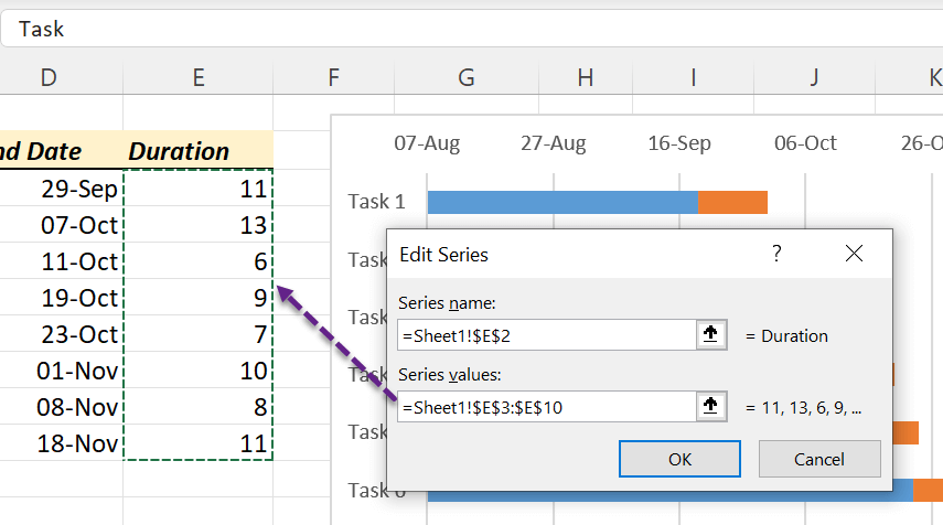
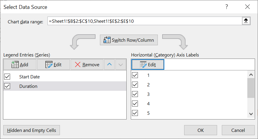
Click on OK and we will be taken back to the dialog, Select Data Source.
The new Data series will be listed under the heading called Legend Entries (Series).
Click OK and the Durations (Orange color) are added to the Bar chart.
Formatting the Bar Chart as a Gantt Chart
Right now, the Bar Chart has blue and orange bars. The Gantt Chart needs the orange bars only, which represent the duration.
To hide the blue bars,
Click on any of the blue bars > in the Home tab of the Excel Ribbon > Fill color > select No Fill
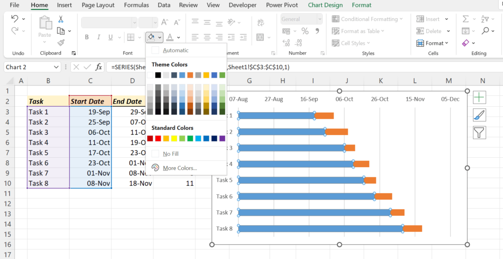
Blue bars disappeared from our Bar Chart!
Next step is to remove the blank spaces before and after the orange bars. For that,
right-click on the data series > Format Axis
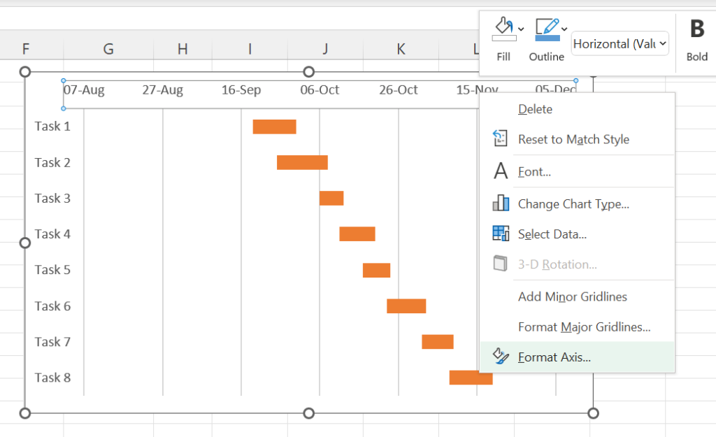
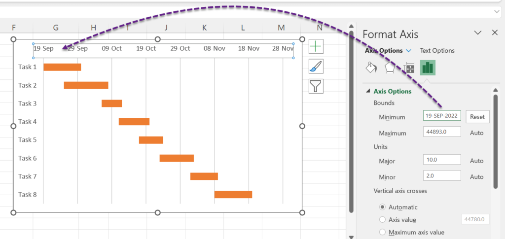
In the Format Axis task pane we can set the Minimum and Maximum values for the Horizontal Axis (Time)
Our project starts on 19-Sep-2022. So, type in 19-Sep-2022 in the input box against the label, Minimum.
The chart will update like the following.
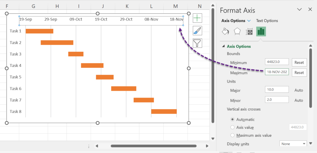
Project is expected to end on 18-Nov-2022. So, type in 18-Nov-2022 in the input box for Maximum.
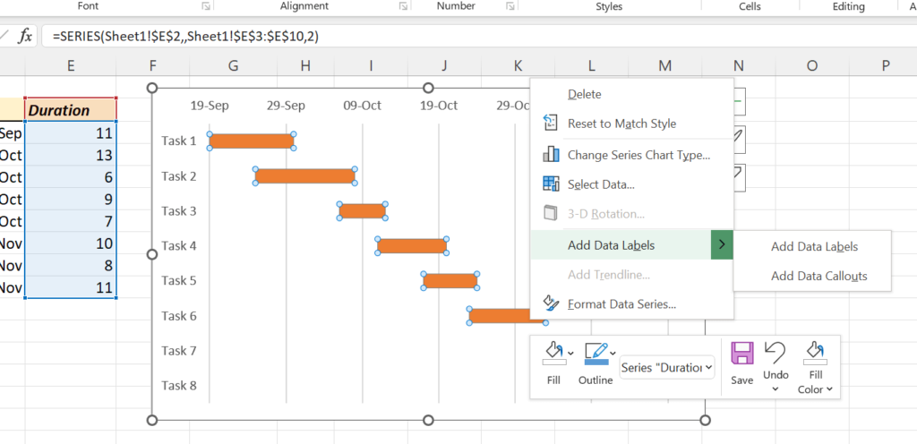
To display the duration as Numeric Values on the chart,
Right click on the data series (orange bar) > Add Data Labels > Add Data Labels
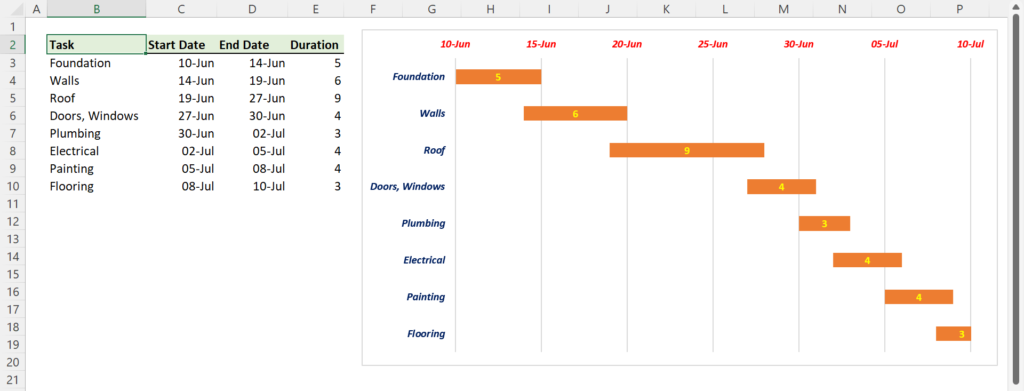
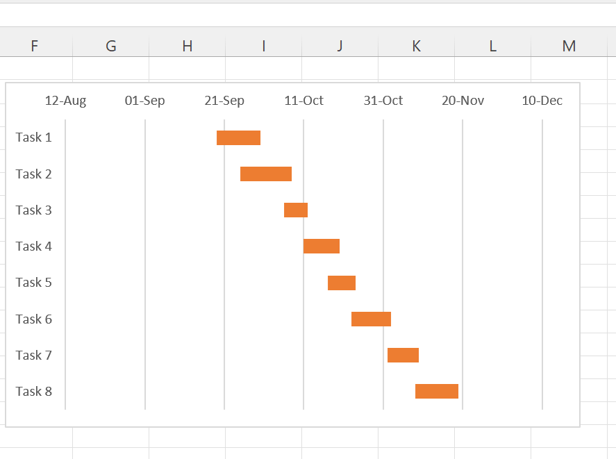
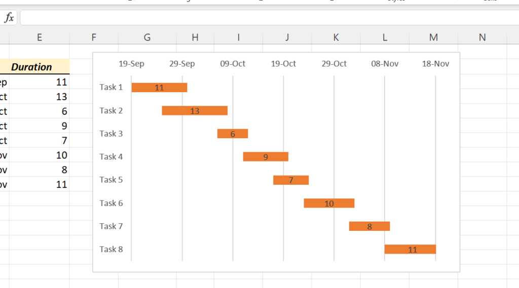
The Durations are displayed on the bars representing them. i.e., our Gantt Chart is ready.
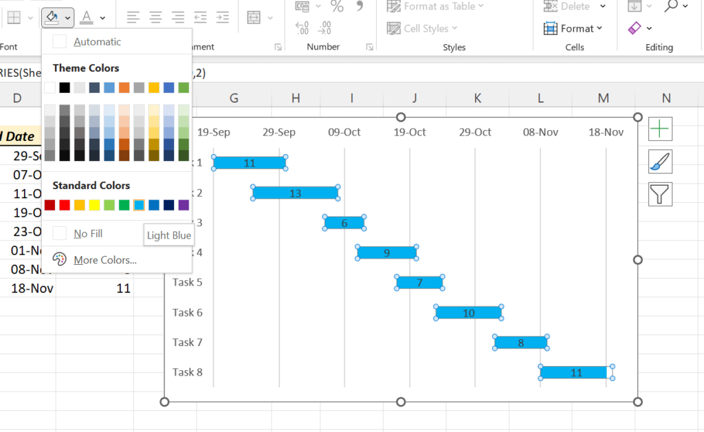
If you want to change the color of the bars,
Click on any of the bars > in the Home tab of the Excel Ribbon > Fill color > select the required color
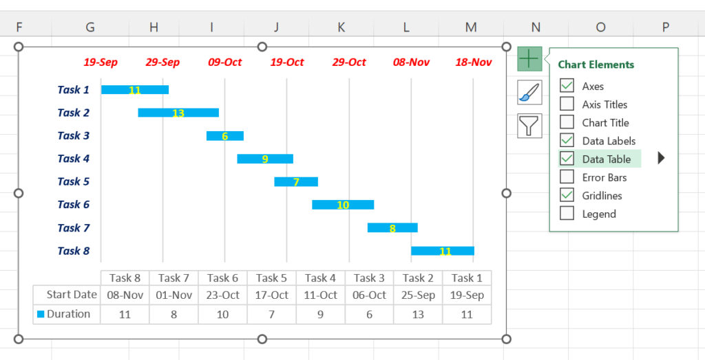
If you want to add the Source data to the Chart as a table,
Click on Chart Elements (Green Plus button on the Top Right corner of the Chart) > Data Table