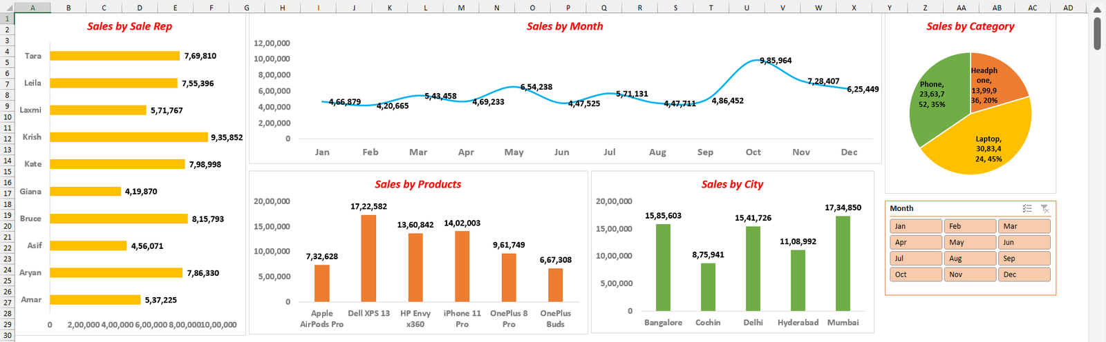
With one detailed prompt, Claude can build a complete sales dashboard inside Excel: a helper column, five PivotTables, five formatted charts and a slicer, laid out on one screen. Here is the exact prompt I used, the sample data to try it on, and why the prompt is written the way it is.
Video
Practice file
The sales data used in the video: 1,600 rows on a sheet called Source Data.
The data
Sales of laptops, phones and headphones through 2025, on a sheet called Source Data, with these columns: Date, Product, Category, Sales Rep, City, No. of Units, Price and Amount. The cities are Mumbai, Delhi, Bangalore, Hyderabad and Cochin, with ten sales reps.
The prompt
Open the workbook, open Claude in Excel, paste this prompt and send it:
I have a sheet called Source Data with sales records in these columns: Date, Product, Category, Sales Rep, City, No.of Units, Price, and Amount. I want you to build a Sales Dashboard from this data. Every chart should summarize the Sum of Amount.

First, add a helper column headed Month immediately to the right of Amount, filled down for every row with =TEXT([the Date cell in that row],"mmm") so it returns the three-letter month name.

Then create 5 PivotTables on a sheet named PivotTables, each summing Amount by: Product, by Category, by City, by Month (use the new Month helper column, not a grouped Date field), and by Sales Rep. Make all 5 PivotTables share the same PivotCache.

Then create a Dashboard sheet with exactly 5 charts and 1 slicer, on a white background.

The 5 charts are:

Sales by Month — a line chart with a light blue line (#00B0F0) at line weight 2.25. Turn ON smoothed line (the Smoothed line option in Format Data Series) and set the marker option to None. This is the wide chart running across the top center, about 850 points wide and 200 points tall.

Sales by Sale Rep — a horizontal clustered bar chart with gold/amber bars (#FFC000). This is the tall chart on the far left, about 310 wide and 428 tall (full height).

Sales by Products — a clustered column chart with orange columns (#ED7D31), placed below the Month line chart on the left, about 455 wide and 217 tall.

Sales by City — a clustered column chart with green columns (#70AD47), placed below the Month line chart to the right of the Products chart, about 380 wide and 215 tall.

Sales by Category — a pie chart with slice colors Headphone orange (#ED7D31), Laptop gold (#FFC000), and Phone green (#70AD47), placed in the top-right corner, about 230 wide and 240 tall. Turn its data labels on showing the category name, the value, and the percentage.

On every chart turn data labels on in bold black Calibri 12 with number format #,##0 (use Calibri 11 for the pie). Hide all the PivotChart field buttons, remove the gridlines inside the plot area, and hide the legend. Make the value axis and category axis text gray (#7F7F7F) and bold at size 12, but make the month labels along the Month line chart size 14.

Make every chart title red (#FF0000), bold and italic, Calibri 16pt, and title each chart with the names listed above.

Add 1 slicer connected to the Month field, showing Jan through Dec arranged in 3 columns, using a light blue slicer style, sorted ascending. Place it in the top-right, directly beneath the Pie chart. Connect this Month slicer only to the PivotTable behind the Sales by City chart.

Layout, left to right: the tall Sales by Sale Rep bar chart on the far left; the wide Sales by Month line chart across the top center; below the line chart put the Products column chart on the left and the City column chart to its right at the same height; put the Category pie in the top-right corner with the Month slicer directly beneath it.

Finally, set the Dashboard worksheet's zoom level to 60% so the whole dashboard fits on one screen. Confirm the zoom is actually 60 when you're done.What Claude builds
- A Month column next to Amount, filled with
=TEXT(B3,"mmm"), so every sale has a month name. - A PivotTables sheet with five PivotTables summing Amount by Product, Category, City, Month and Sales Rep, all sharing one PivotCache.
- A Dashboard sheet with five charts: a smoothed line for months, a bar chart for sales reps, column charts for products and cities, and a pie for categories.
- Formatting on every chart: data labels, red titles, grey axes, no gridlines, no legends and no field buttons.
- A Month slicer with Jan to Dec in three columns, under the pie chart.
- Zoom set to 60%, so the whole dashboard fits on one screen.
Why the prompt is written this way
- It names every sheet and column. “Source Data”, “PivotTables” and “Dashboard” leave nothing to guess, so the result is the same every time you run it.
- It asks for a Month helper column instead of grouping the Date field. Text months are easier to sort, filter and connect to a slicer.
- One shared PivotCache keeps the file small and lets one slicer control several PivotTables later.
- Exact colours and sizes (hex codes, points, font sizes) give you the design you want on the first try instead of a default look.
- The layout is described in words: left, top centre, below, top-right. Claude places charts the way you’d explain it to a colleague.
- The last line asks Claude to confirm the zoom. Asking for a check at the end makes it verify its own work.
After it’s done
- Click a few months on the slicer and check the City chart changes. In this prompt the slicer is connected only to the City PivotTable. To make it filter every chart, right-click the slicer → Report Connections and tick all five PivotTables, or ask Claude to do it.
- Check a couple of totals against the source data, for example with SUMIFS. AI tools can make mistakes.
- Ask for changes in plain English: “make the bar chart blue”, “add a Sales by Quarter chart”, “sort the sales reps from highest to lowest”.
- When you add new sales rows, right-click any PivotTable → Refresh.
Build it by hand
To learn each step yourself, follow how to create a simple dashboard report in Excel, which builds a similar dashboard with PivotTables, PivotCharts and a slicer, step by step.
More Excel files and templates are in my XL n CAD shop.