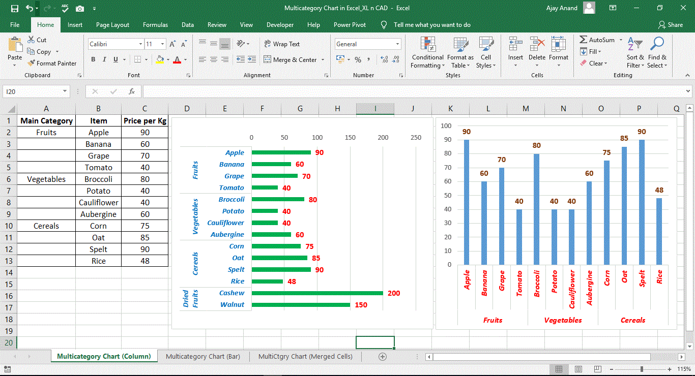
Excel charts allow users to create visualizations of data sets. A chart can give a clearer picture of the dataset than a table with numbers.
The benefits of charts and graphs also come into play in presentations, where they can be used to quickly illustrate trends in data.
The following are the most commonly used chart types in Excel.
Column chart
Bar chart
Line chart
Pie chart
Doughnut chart
Area chart
Apart from the above, Excel has more chart types like,
XY (Scatter) chart
Bubble chart
Stock chart
Surface chart
Radar charts
Combo charts
Excel chart types that are available only with Office 2016 and newer versions of Excel,
Treemap chart
Sunburst chart
Histogram charts
Box and Whisker charts
Waterfall charts
Funnel charts
Read more about the most commonly used chart types in Excel
